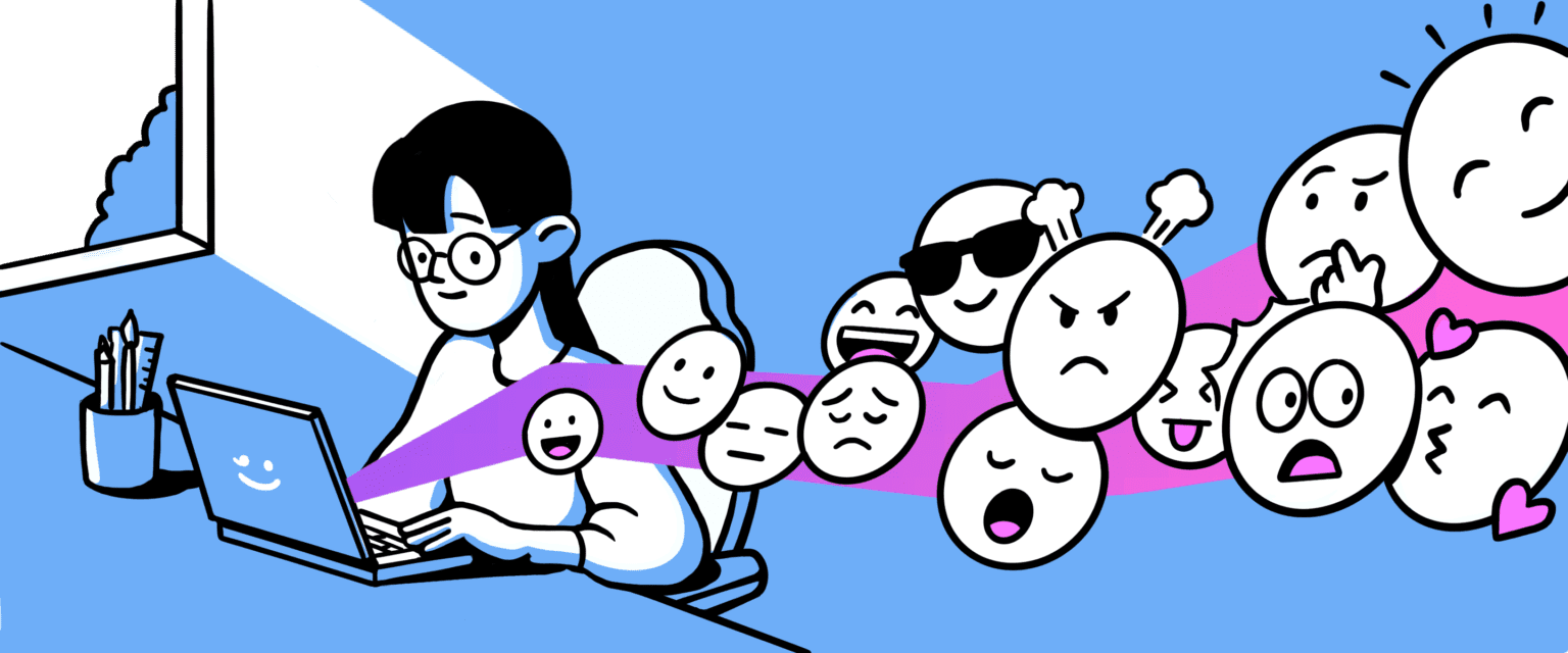
Think again about the time you saw a picture or a visual image. Have you ever felt something when you saw that picture? Sad? Angry? Did you feel happy? That is how an emotional design works.
As it turns out, a visual can convey a million emotions and feelings. Like when you see a picture of a beach, you will feel relaxed and happy. When you see a mountain picture, you will feel calm and focused.
An excellent visual is an image that can evoke the emotions of someone who sees it.
A design should evoke a feeling
As human beings full of feelings and emotions, we tend to react to what happens to us. Reactions arise when we perceive a stimulus from the senses, such as sight, hearing, smell, taste, and touch.
In a visual context, reactions occur after we see a picture.
Emotional reactions can arise in the form of feelings. There are eight core emotions, according to a psychologist named Robert Plutchik. These eight emotions form the basis of derived emotions, grouped into several categories, namely:
- joy and sadness
- acceptance and disgust
- fear and anger
- surprise and anticipation
Those feelings can emerge when looking at a design. For example, consider Maslow’s Pyramid of the user’s need for a visual. Although the ‘pleasurable’ part is in the last order, many still take this element of a design.
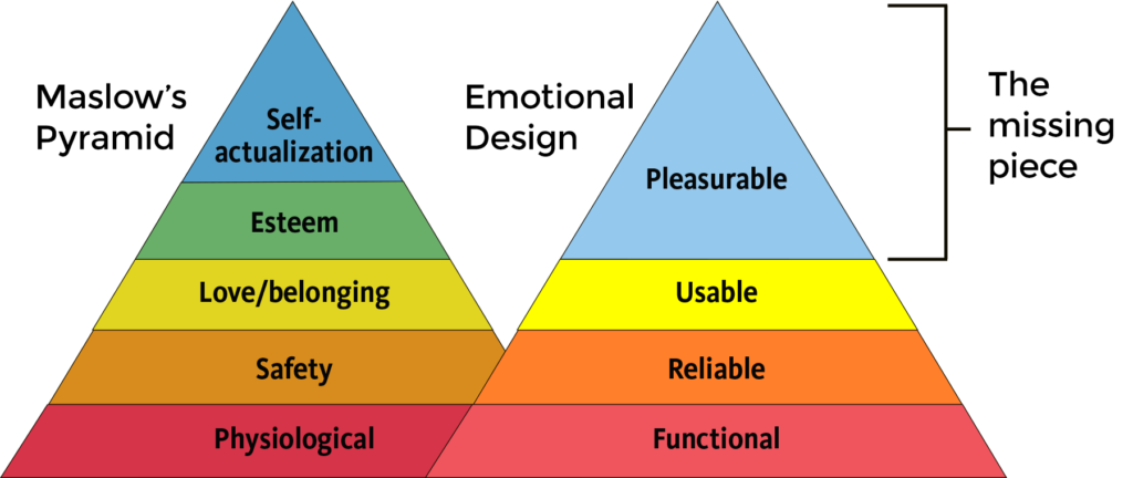
The pleasurable element can give an intangible feeling that cannot be found or owned by other objects. Therefore, a design will feel personal and touch the audience’s heart when it has that intangible value.
Design essentials that bring out emotions
You want to create a design that moves the person’s feelings. But remember, there are things you should consider before making an emotional design. This guide will help you increase the value of that design.
Those three things are:
- Functionality is how the product can solve users’ problems.
- Reliability is how the product works well and has minimal errors.
- Usability is how the product is easy to use, effective, and efficient.
Without these guides, the application of emotional design will be in vain.
Furthermore, you can apply three types of emotion to your design. It might be for the visual image, products, application, or even social media content:
1. Visceral Design
You can use visceral emotions when a new audience opens a design or application. It works like falling in love at first sight. The first stage of emotional design is about giving an excellent first impression. After that, you can build a micro-interaction or good copy.
For example, it is crucial to create a beautiful user interface. The user interface doesn’t only help with the function but also ensures that the audience is interested in using it.
2. Behavioral Design
The second stage is behavioral emotion. Behavioral emotion can appear when an audience is using your product. You can also use a mascot to gain the audience’s interest.
Users judge your design unconsciously based on how easily they can accomplish their goals with it. Therefore, they should be satisfied knowing they are responsible for their actions.
For example, the design of a smartphone will affect its use. It’s either you can store the phone in a pocket or bag, place it on the table when discussing with other people, and the overall operation of the smartphone.
These behaviors will evoke users’ emotions in assessing the product’s design. The more straightforward the operation, the more valuable the product is to users.

3. Reflective Design
In this stage, the audience is entirely aware of their feelings. Therefore, this emotion is different from the other two. There are several types of responses that users can choose. Usually, there is only one response option.
For example, LinkedIn has a “like” option for each post with many emoticons. The audience must consider the correct reaction by choosing one emoticon.

Give your design a touch of emotion
The wheel of emotions displays the emotions that go with various hues. In addition, the opposites of certain feelings, such as happiness and sadness, surprise and anticipation, trust and mistrust, are also displayed.
Thus, by using the wheel of emotions, you can find ways to include colors with images and text to provoke particular feelings.
You can utilize red and orange to convey warmth. Red and orange build a feeling of hunger. If you want to advertise a food product, you will choose those colors for your message’s banner. Look at this KFC design for its promotion.
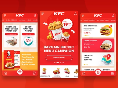
Here are some tips for playing with the wheel of emotions to apply in creating expressive designs.
1. Basic Emotions
The most basic emotions are the primary ones: trust, fear, surprise, sadness, disgust, anger, anticipation, and joy.
2. Combinations
The sum of these various core emotions will produce new ones such as:
- Love = (Joy+ Trust)
- Guilt = (Joy + Fear)
- Delight = (Joy + Surprise)
3. Opposites
Like many things in nature, there is a duality with emotions; hence each one has its polar opposite:
- saddens is the opposite of joy
- trust is the opposite of disgust
- fear is the opposite of anger
- surprise is the opposite of anticipation
But, honestly, playing with the wheel of color only doesn’t guarantee that you can evoke emotion through design. Thus, you need to add some elements to create an emotionally-moving design.
- Create a personal identity for your work.
- Make a character out of your design to engage users.
- Make good use of color and contrast (blue for banking signifies reliability, for example).
- Create a copy in the appropriate tone to arouse or satiate emotions.
- Use typefaces and styles suitable for the image you wish to convey.
- Use audio and video to share messages “in character.”
- Adapt the experience for various users
- Rewards, giveaways, and surprises
- Use captivating narrative.
Now, are you going to apply the emotional design to your product? Visit our Instagram @nicetomeetyou.studio for your reference!
