
POSTED IN
Design
WRITTEN BY
Handoko Lun
DATE
Have you ever noticed how certain color palette dominate the tech landscape? From the cool blues of Facebook to YouTube’s red and Android’s green, these colors play a powerful role in branding and conveying complex ideas about a company’s values, such as trustworthiness (blue) or innovation (green). Even though the tech industry is strongly associated with certain sets of colors, they shouldn’t be the be-all and end-all for you. There are limitless possibilities. By combining the right colors into a cohesive and comprehensive color palette, you can deliver a powerful message to your audience. Here’s a collection of color palettes to inspire your tech-focused designs.
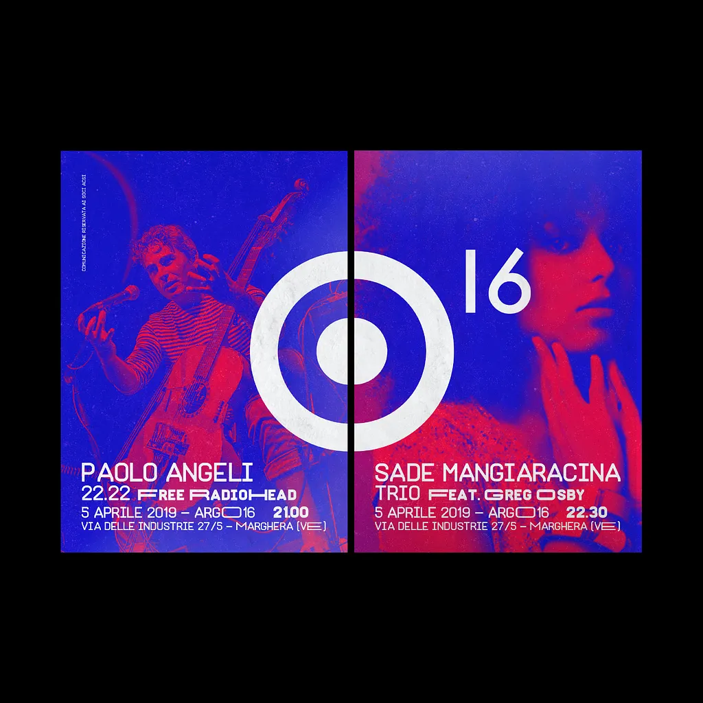
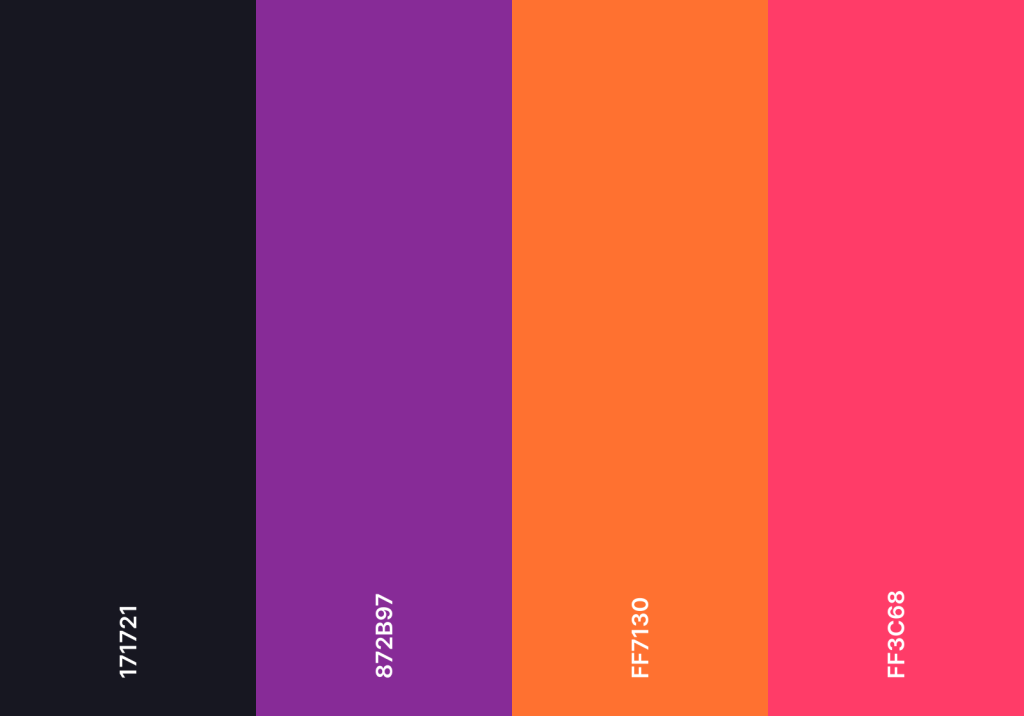
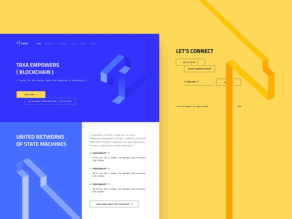
Color Palette #1: Innovative and Reliable
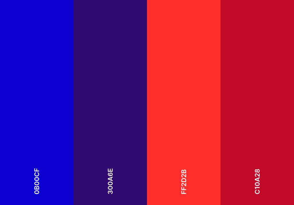
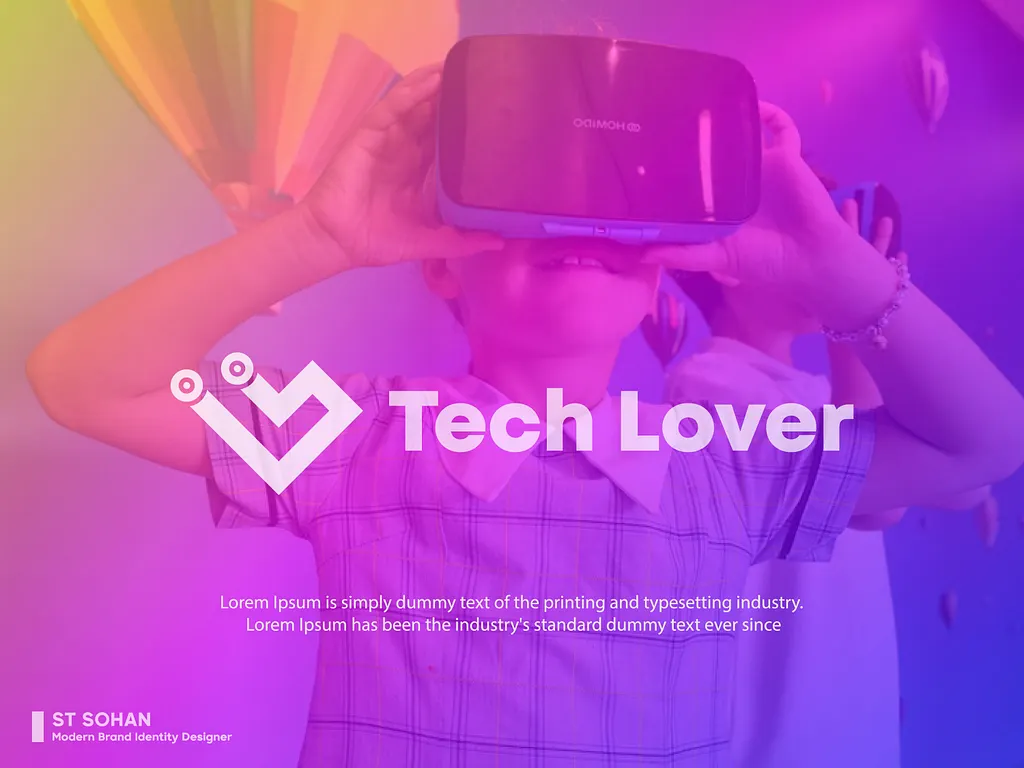
The combination of blue-purple and red strikes in this color palette a balance between cutting-edge innovation and dependable reliability. The blue-purple, with its associations of imagination and wisdom, hints at the complex technology and innovative solutions at play. Meanwhile, the red, symbolizing energy and action, adds a dynamic element, suggesting a user-friendly and engaging experience. This color palette is suitable for brands that tackles innovative technological advancements, such as AI or VR.

Color Palette #2: Trustworthy and Stability
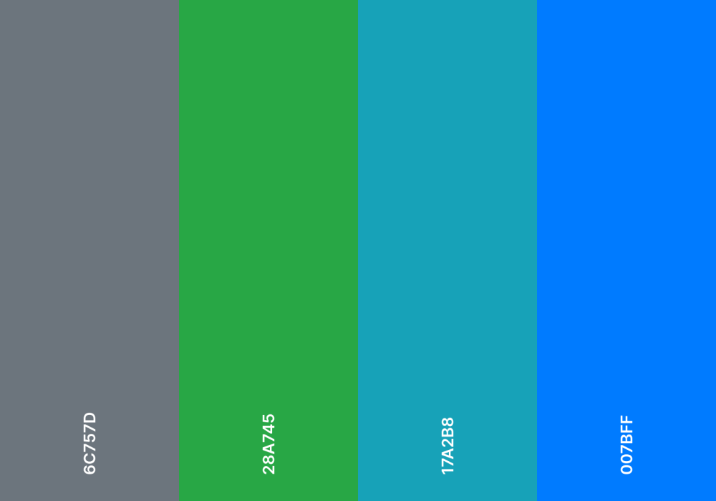
Psychologically speaking, the shades of blue and green in this color palette are meant to evoke the feeling of trustworthiness and reliability while the contrasting grey is to reflect stability to ensure that the brand can last for generations to come. This color is typically used for fintech brands, cloud computing services, and many more.


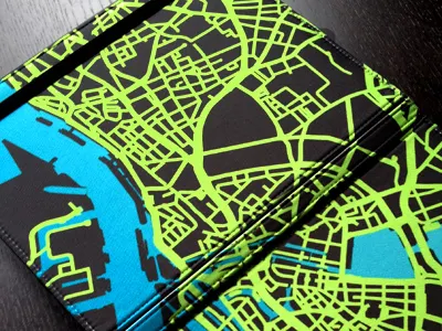
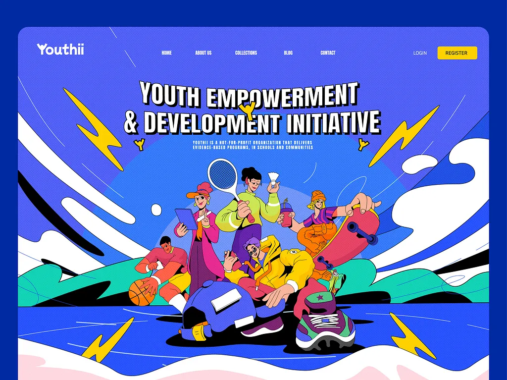
Color Palette #3: Energy and Forward-thinking
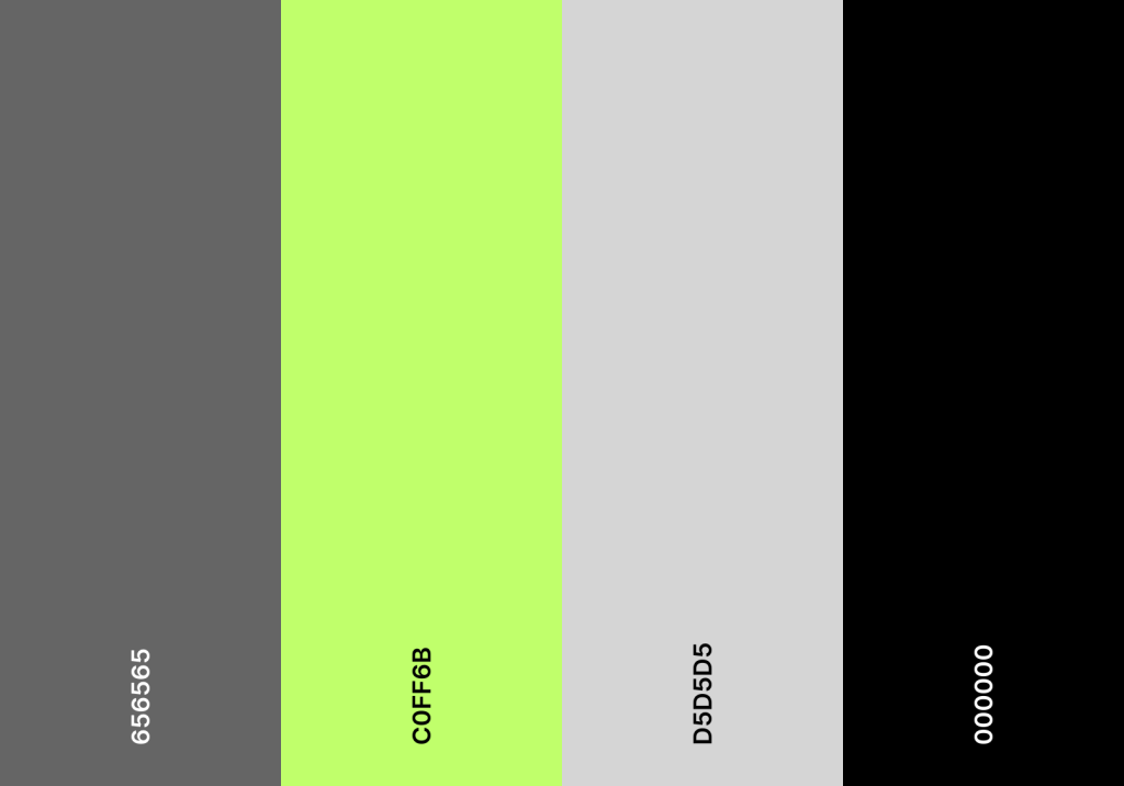
One glance at this bright neon green and you can immediately tell that this is NVIDIA, but this color palette can be associated with a lot more things. The contrast between the neutral colors and the bright green conveys a modern and futuristic look, suggesting that the brand is at the forefront of technological innovation. This philosophy can be applied to brands in data analytics, cybersecurity, gaming, and many more.


Color Palette #4: Contemplative and Soothing
This color palette, with its contrasting colors and grounding gray, can be seen as promoting mindful technology use and a focus on inner peace. It is suitable for a tech company that encourages users to find balance and calmness in a fast-paced digital world such as mental wellness apps, creative software, or even social media platform.


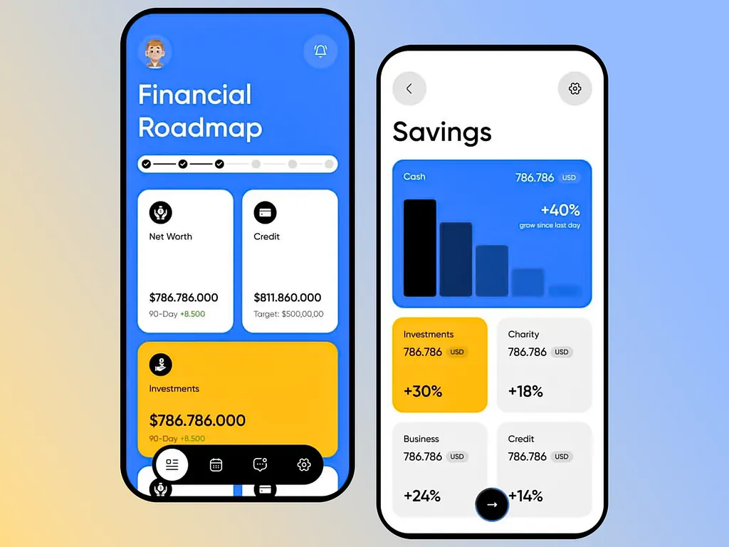
Color Palette #5: Exciting and Dependable
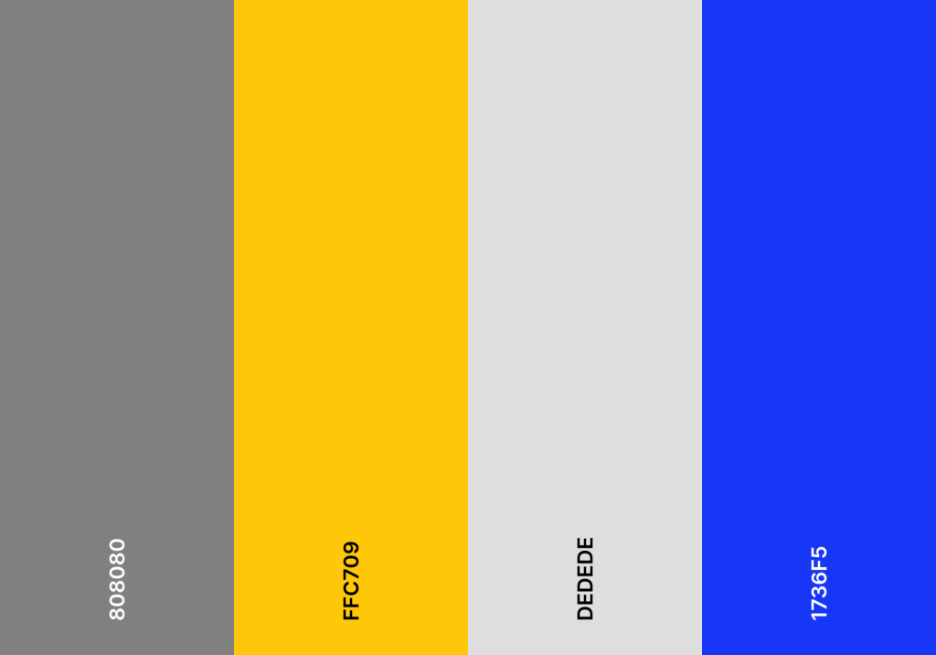
Take a look at this color palette. The vibrancy of mustard yellow and primary blue is instantly balanced out by the neutral tone of the grays. While the yellow and the blue inject the energy and dynamism, the grays provide the stability. This color palette can be used for many things, such as fintech brands, e-commerce platforms, project management tools, and educational technology.
Conclusion
Once again, the color palettes for tech are not limited to the ones we showed above. This list is to help you spark new inspirations. So, feel free to explore and experiment with all sorts of colors to accurately represent the brand’s philosophy.
To design is nice and all, but do you know that it is not the only skill you need to be a great designer? Click here to learn more about that.