POSTED IN
Marketing
WRITTEN BY
Nay Madani
DATE
Not only in the field of medicine and technology, design is also a global area with a particular community and terms. It also has a lot of confusing and complicated vocabulary. As a tech-savvy business owner, you must understand the worldwide things about designs. Therefore, learn the design terms you usually hear when working on design projects.
Learn about it to create a design that has harmony and can attract the audience’s attention quickly.
All elements in design create harmony
The design has essential principles and elements. We will get a good design result when all these aspects are combined. Therefore, make sure that designers who work on creating your visual must pay attention to the principles and design terms. They are the leading and most important component in making designs.
Design terms become the principle when creating your visual. It will stick to the principles of layout, hierarchy, typography, and color codes. Understand at least these four design terms to comprehend your designer’s explanation. Thus, you cannot separate the pieces. On the contrary, these crucial components complement each other and create harmony in your designs.
Design terms are all words related to design. Of course, as a business owner, you don’t need to master all the terminology. But, try to understand the important and often used words by designers. You need to do this activity to make your communication with the designer acceptable. So, both parties had no problems, and the designers provided excellent results.
This phenomenon is closely related to when you provide effective feedback to the designers, especially when you get frustrated because the design results don’t match your expectations. So, you can immediately point out which part you want to improve after the designer displays the results. Your feedback will not be long-winded, and finally, you can achieve your project goals.
Important design terms you should know
As mentioned, you don’t need to know all the design terms. However, learning the basics is the key to success in creating your successful and captivating design.
– Layout
Layout or composition is the arrangement of design elements that form a complete image. A good composition can draw the audience’s attention to your visuals. Therefore, it would be best to consider the layout so the audience can determine which ones to see and where to start observing them. Layouts include various visual design elements, balance, proximity, alignment, repetition, contrast, and white space.
– Hierarchy
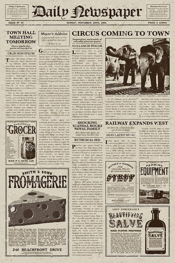
In design, hierarchy means grouping elements according to their contents’ importance. Examples of this design term are in newspapers, magazines, film posters, and other images that require the audience to distinguish words and pictures. For example, the title is usually placed at the top, while the subheadline and body copy are below. Ensure you know which information is vital and which is not, so that the hierarchy is correct.

– Typography
Writing in designs is not just putting letters in any place. You need to pay attention to the selection and placement of the fonts used in the design. One of the things you often hear in the typography section of design terms is choosing the right font for your brand. See the example below.
a. If you want a formal style design, use a serif font.
b. Casual and modern style can be associated with sans serif type fonts
c. Last, you can use the script to show a simple handwriting touch.
In addition, also pay attention to the use of color, size, boldness, cases, and style, such as italic, when writing on the design.

– Color codes
Color theory is the study of how colors affect the audience’s feelings. You can use it to explore the types of colors that match various designs. For example, you can choose a monochrome scheme for a robust web. On the other hand, use red and orange for your food product ad.
Don’t forget to use colors that are visible to the computer. Color-coded formats vary, but there are generally three types of them. For example, the color magenta in RGB (Red, Green, Blue) has a code of 236,0,140, while CMYK (Cyan, Magenta, Yellow, Black) has a code of 0.100,0.0. Finally, the HEX Code shows it as #EC008C.
Work with the best design service
Work with a capable design service to produce the best visuals. Nice To Meet You Studio always brings you design options that are always available. We will also explain in as much detail as possible until you comprehend our services and results. In addition, we will serve all your needs for social media and websites with design terms and explanations that you can understand.
Visit our Pricing Page to find out the package you need. Then, adjust it to your company’s needs and schedule a call now.
Don’t forget to visit Instagram @nicetomeetyou.studio to see our portfolio and how it works with us!


