POSTED IN
Marketing
WRITTEN BY
Nay Madani
DATE
Becoming a designer is not easy. Designers must be able to portray the target audience’s desires, and the design should evolve by following the design principles.
There are guidelines for creating a captivating visual. You have to follow the principles and essential design elements to create harmony.
Harmony is the sense that all your design elements are part of one whole. You can achieve design harmony through repetition and consistency.
Designers can achieve harmony by applying the elements and principles throughout the visual identity. For example, you can balance a design with a consistent color palette, typeface, photography style and more.
Crafting a design needs some principles
Designers use design principles to arrange visually appealing and understandable content, especially on websites and other user interfaces. Audiences must quickly comprehend what they see and locate what they are looking for when the designer builds the visual.
Without it, the audience would have trouble connecting disparate goods that were grouped and eventually leave. Never confuse or make your audience get uncomfortable with your designs. Instead, point them toward their options so they may quickly connect with businesses or brands.
Follow these principles to visualize your story
When presented with choices, designers must decide one aim to forgo in favor of another. Design principles are one helpful tool to help designers make the proper visual. In addition, these guidelines encourage designers to create captivating visuals.
1. Negative space
Negative space becomes a character of a good design. The first thing that typically springs to mind is leaving white space around design elements. However, other methods employ that white space to imply a component that isn’t present. Negative space includes the area surrounding design elements. Leave enough negative space for it to look less heavy and cramped.

2. Proximity
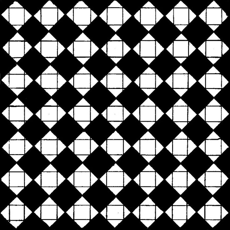
Proximity uses space as confinement. When you arrange elements closely together, they are perceived as a unit rather than separate elements. Closeness is particularly true when group members of designs are nearer to one another than any other design parts.

3. Repetition
Repetition is connecting visual elements or relations in repetition. For example, the repeated use of similar shapes, colors, or lines can be even or uneven and regular or irregular. Repeated elements can radiate outward from a central location in a process known as radiation. In contrast, gradation is a type of repetition where the repeated pieces gradually get smaller or bigger.

4. Contrast
When two or more visual elements in a composition are dissimilar, contrast arises. Contrast is a tool used in design to enhance impact, emphasize significance, produce compelling images, and provide visual appeal and dynamism. Contrast depends on context. Although we may assume that the chosen optical element in a composition speaks for itself, we can determine the optical meaning by the surrounding visual characteristics.

5. Alignment
The alignment principle in design asserts that alignment happens when several items are positioned so that their left or right edges, or center lines, line up on a familiar spot. The positioning of design elements along the boundaries of any composition is known as edge alignment. The positioning of design elements along the composition’s fictitious center axis is known as center alignment.

6. Focal point
According to this principle, a focal point will direct our focus to contrast. A contrast also means the aspect that is different from the others. For example, it would be best to focus on the square in the middle of the circles. It’s unlike the other elements in terms of shape and color.

Know when to follow the design principles
Being a designer is not just about designing what you want but also being responsible for the designs you make. Then, a designer must consider how the target audience will perceive the design.
Theoretically, as a professional designer, you will work hard to apply design principles in graphic elements to illustrate the image and copy. But then, you can make your design exciting and easy to understand.
Therefore, a designer must foremost master design principles and essential elements to create a captivating visual.
Make sure you consider the audience’s point of view when making a design. Therefore, you will know when to follow the principles and when not to do it.
In Nice To Meet You, we always create a design within the law of simplicity and stand in our audience’s shoes. Therefore, it truly has the power to captivate the audience’s interest.
Apply design principles to your brand by working with Nice To Meet You. Visit our Instagram @nicetomeetyou.studio to check on our portfolio!


