A logo design is a symbol that represents an idea, message, or product. Businesses need to periodically update their logo and refresh it to attract the attention of new and potential customers. This article delves into the trends driving change in logo designs and offers tips for making your logo more relevant.
A Logo as The Face of Our Brand
A logo must stand out but not clash with the overall brand image. It should be able to stand alone, whether printed on a t-shirt or as part of a more extensive campaign. It should be easily recognizable, not too crowded, and not too simple.
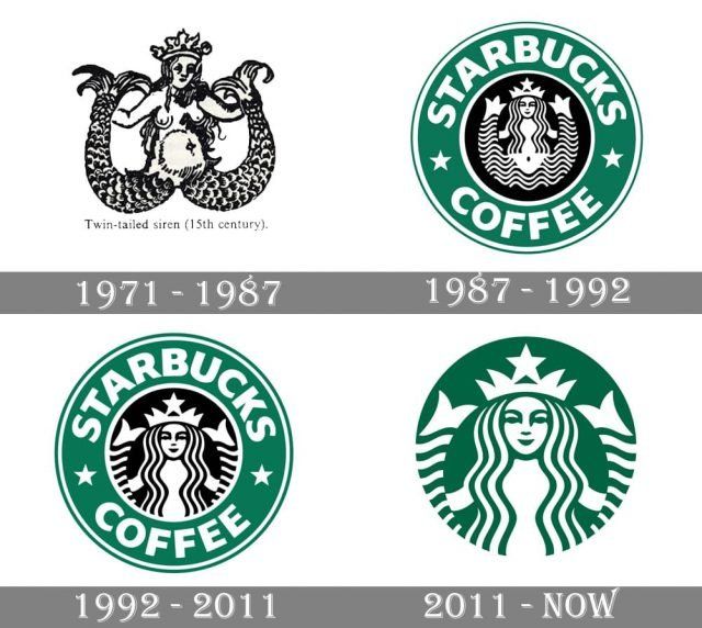
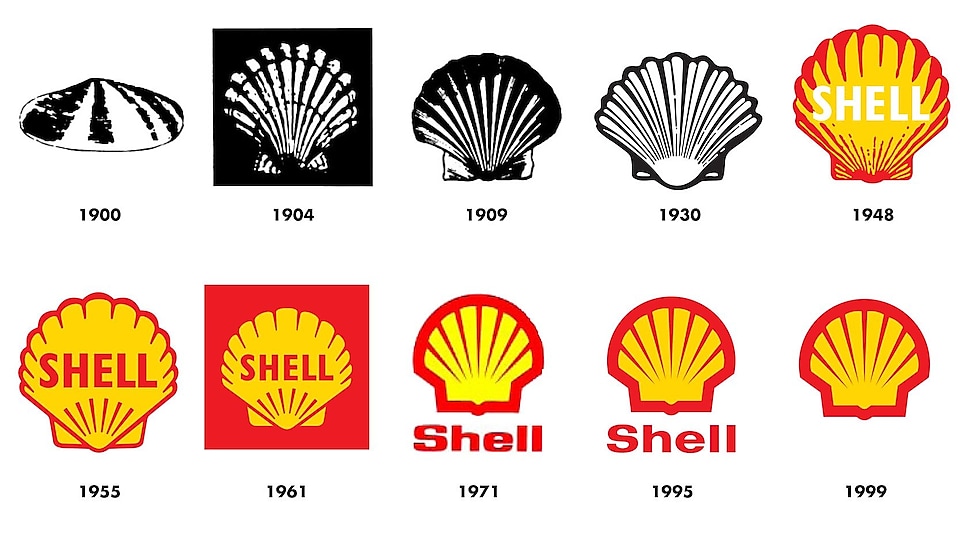
Big brands worldwide have been changing their logos. Some of them even changed it several times to modernize their identity. As time goes on, design standards change, and companies want to look as clean and appealing as possible so people can buy their products and services. Here are examples of big brands that updated their logo.


You want the logo’s character and personality without being cluttered or overwhelming. In addition, you want your logo to look good when presented in black and white or color so that it can work for all kinds of applications, such as website headers and print ads.
So, these are the key points of why is your logo important as a brand identity:
– A logo makes a solid first impression
– It is the foundation of your brand identity
– A logo separates you from the competitor
– It fosters brand loyalty
Notice The Signs to Update Your Logo
You want people to associate with your brand because they recognize it as yours. That means we must create a consistent look across all mediums: website, social media profiles, business cards, and more.
But there are signs that the time to change your brand’s logo has come. So, when will it be?
1. The logo is old
Despite loving your company’s logo upon creation, sooner or later, you’ll realize that it has become stale and no longer as relevant or enticing as before. Usually, one or two design aspects are no longer fashionable, resulting in a logo that looks ten years old.
Your logo designs often are influenced by the design standards, norms and trends of the given period. This dynamic industry implies that the logo will become obsolete in the future. Consider when your logo was last updated and whether it is beginning to show signs of wear and tear.
2. The logo is too complex
Logos with various details and multiple gradients don’t always translate well to the digital world. Companies founded before the digital age may discover their logos look fantastic on letterhead but not so well in profile photographs or digital ad creative.
In today’s world, modern design is all about simplicity. Fortunately, logos that aren’t overly complicated usually appear best on the web. However, if your logo is difficult to view or comprehend when you look at your web domains, it’s a hint that a redesign is a must.
3. The company is growing
Perhaps you’ve recently added a whole line of new items, enlarged your headquarters, or hired much new staff. When starting your business and your company created a logo, it was most likely an outstanding representation of everything you stood for. But, as we all know, no corporation can stay in the same place long.
Over time, businesses expand and change dramatically. The company introduces new services, products, and missions. Mergers and acquisitions happen all the time. Changes in a company are typically something to be proud of because they are often the result of growth and development.
Unfortunately, these suitable alterations may make a company’s initial logo less than entirely relevant. On the other hand, a logo change may be just what you need to communicate a shift in your company’s direction.
Few Steps to Update Your Logo
If you’re looking for a fresh take on your company’s logo, then you’re in luck. We’ve created a guide to help you make sense of the different styles available and when it’s best to use them.
The design of your logo should match the look of your website, promotional materials, and other aspects of branding, so everything works together cohesively. Therefore, selecting the right font and shape for your logo can be simple if you follow these guidelines:
a. Find a balance between unique and readable
b. Ensure that the font and shape style is appropriate for your business
c. Create a memorable typography statement with your logo, creative lettering, and spacing
d. Be aware that different fonts and shapes convey additional messages.
You must ensure that it is readable but also unique. Choose something which will stand out from the crowd. Make sure it isn’t so obscure that no one can read it. Also, use an appropriate font style for your business.
Do you want to update your brand’s logo for a fresher look? Nice To Meet You can help you create a timeless logo. Visit our Pricing Page to choose your plan on updating your brand’s logo!


