POSTED IN
Marketing
WRITTEN BY
Nay Madani
DATE
Did you know that the human brain captures visuals very quickly? Therefore, visual identity is crucial because it closely relates to human brain psychology. Thus, choose a visual identity package that fits your brand.
Branding psychology is not just a term used in marketing. But, it associates very profoundly with science. In particular, the visual identity package on the brand focuses on how a brand uses psychological principles to connect with the target audience. These principles include color psychology, pattern recognition, feelings of belonging, and brand persona.
So, read this article until the end to understand the steps in gaining the audience’s memory and trust through a great visual identity package.
What a brand looks like without visual identity
A brand that does not have a visual identity equals humans who do not have a face:
- People won’t recognize you even if you have a name.
- They become unsure and scared of when to talk to you.
- Other people won’t even bother assuming that you exist.
If that’s the case, everything will be difficult. You will find it hard to introduce yourself because other people are hesitating about your existence. They won’t believe anything you say, do, or show. This behavior can happen because you don’t have a face that your audience can remember and trust.
So, visual identity becomes the foundation for all the business you will do. First, create a visual identity that is easy to remember and connects with the audience until it slips onto their subconscious. From there, your brand will influence the audience’s mindset in the decision-making process to shop for a product.
The fundamentals of a visual identity
The visual identity package is fundamental before the brand runs its business. The following points are essential before you apply your visual concept in all lines of business. So then, what’s inside the visual identity package? Check out the explanation below.
– Graphics
In the context of visual identity, graphics are image assets created by the creative team. Its form is in the form of shapes, icons, illustrations, or animations. These elements should apply to all parts and goods of your business. It becomes the most critical thing in a visual identity package because the graphic shows a visual style associated with your brand’s values, vision, and culture. Therefore, the application must be easy to understand for the audience to form an emotional bond and knowledge about your brand.
Look at the logo of one of Indonesia’s famous airlines, Garuda Indonesia. This brand uses bird visuals that signify something flying, an airplane. The lines denoted by the blue wings indicate that this airline is premium and seeks business-working people and the middle to upper classes.

– Visual Brand Guideline
There is a brand guideline in the visual identity package. Why is that so? Because it contains vital things like a color palette. Use visual forms that show your brand color persona so the audience can remember. Visual guidelines are fundamental because they can influence the audience’s emotions and enter their subconscious. So when people see a set of colors, they can immediately tell it’s your brand.
This visual identity package is also crucial when you apply your visuals on all online and offline platforms.
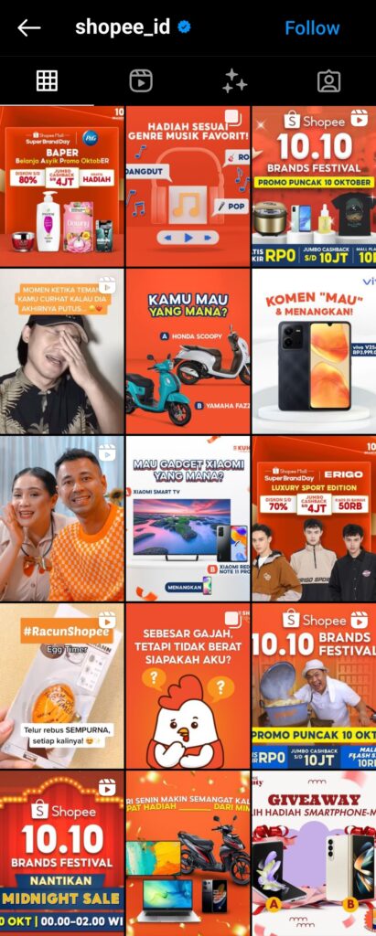
Let’s look at the well-known e-commerce brand in Southeast Asia, Shopee. Shopee uses a dominant palette of orange with accents such as white and yellow that go along with the base color. When they see this color, people will immediately remember Shopee.

– Typography
Typography is the form or style of text used in a brand. It has different fonts that have other effects on the audience. For visual identity purposes, you should consider wordmarks in your logo, title fonts, and body copy fonts.
Choosing your brand’s font, diction, and language style, whether on social media, websites, or print media, is a unique feature for the audience. Define your brand persona in this visual identity package divided into a formal, relaxed, or quirky language style.
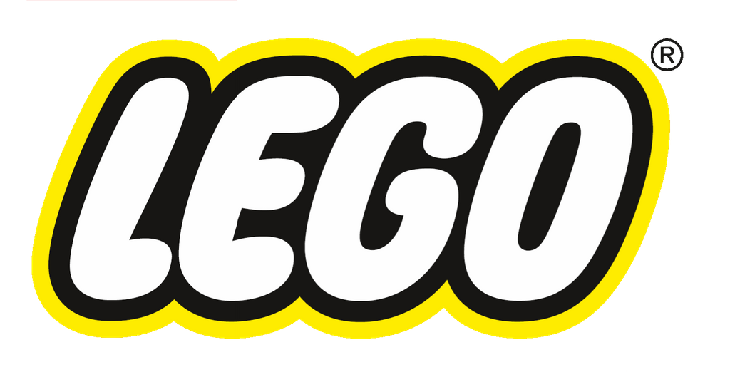
Look at the typography on this LEGO logo. It uses the ITC Novarese font, which helps the design easier to read than most sans serif type styles. Another aspect of the design that allows legibility is the slightly uneven weight of the character strokes. The brand uses this method because most of LEGO’s targets are children and the young community.

Create a strong brand foundation with Nice To Meet You Studio
Nice To Meet You Studio offers you a visual identity package consisting of logo creation, brand guidelines, and concept creation for your brand. We will research and develop your brand to make it stand out, unique, and different from the others. Give it a month or two and see how your brand grows from the ground up.
Determine the proper visual foundation to seek for your brand’s success. Show more of who your brand is through a logo, especially for people who worship brands like gods. Please do it now or never.
We believe you will achieve your brand’s goals through the Foundational visual identity package. So, schedule a call with us now to get a further explanation about this package. Also, don’t forget to visit our Instagram @nicetomeetyou.studio to check on our work!


